Footer
Overview
The Footer component is a customizable page footer that includes navigation links, social media connections, and legal information. It's responsive and supports multiple layout variations.
Preview
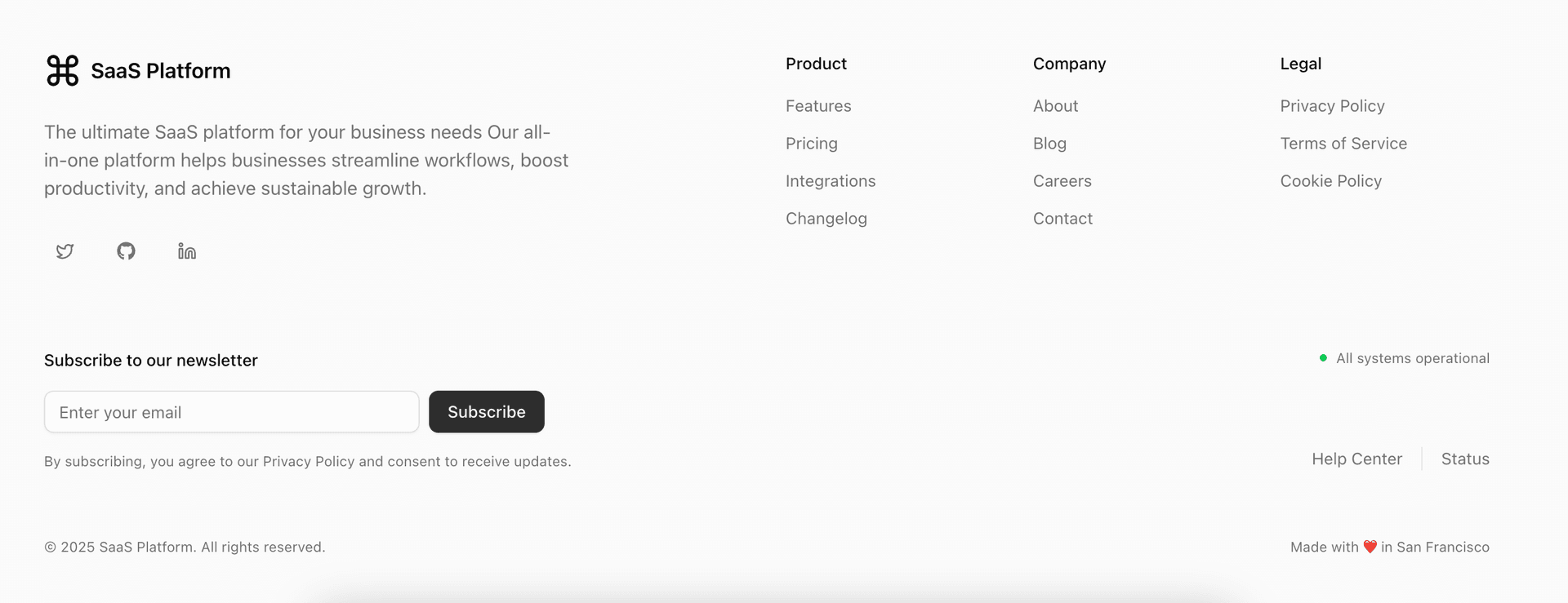
The Footer component showing navigation sections, social links, and legal information.
Basic Usage
Import and use the Footer component in your layout:
import { Footer } from "@/components/layout/footer";export default function RootLayout({children,}: {children: React.ReactNode;}) {return (<>{children}<Footer /></>);}
Props
Optional Props
interface FooterProps {className?: string; // Additional CSS classesvariant?: "default" | "slim" | "centered"; // Layout variantlogo?: React.ReactNode; // Custom logo componentnavigation?: {title: string;items: {title: string;href: string;external?: boolean;}[];}[]; // Navigation sectionssocial?: {github?: string;twitter?: string;linkedin?: string;discord?: string;}; // Social media links}
Layout Variants
Default Footer
<Footernavigation={[{title: "Product",items: [{ title: "Features", href: "/features" },{ title: "Pricing", href: "/pricing" },{ title: "About", href: "/about" },],},{title: "Resources",items: [{ title: "Documentation", href: "/public-docs/docs" },{ title: "Blog", href: "/blog" },{ title: "Support", href: "/support" },],},]}social={{github: "https://github.com/your-repo",twitter: "https://twitter.com/your-handle",}}/>
Slim Footer
<Footervariant="slim"navigation={[{title: "Legal",items: [{ title: "Privacy", href: "/privacy" },{ title: "Terms", href: "/terms" },],},]}/>
Centered Footer
<Footervariant="centered"navigation={[{title: "Company",items: [{ title: "About", href: "/about" },{ title: "Contact", href: "/contact" },{ title: "Careers", href: "/careers" },],},]}social={{github: "https://github.com/your-repo",twitter: "https://twitter.com/your-handle",linkedin: "https://linkedin.com/company/your-company",}}/>
Customization
Custom styling with Tailwind CSS:
<FooterclassName="bg-gradient-to-t from-orange-500/5 to-transparent border-t border-orange-500/10"variant="default"navigation={navigation}social={social}/>
Custom logo component:
<Footerlogo={<div className="flex items-center space-x-2"><Image src="/logo.svg" alt="Logo" width={32} height={32} /><span className="font-bold text-xl">Your Brand</span></div>}navigation={navigation}/>